Friday, July 31, 2015

Dogwood Crossing - July 2015 BOM

The "kit" for this month's block contains the usual pieces of fabric and instructions.


Page 1
Page 2
Finally, we are back to some yellow and a lighter green.
The cutting this month was tricky. It was not a simple case of following the template. Some of the pieces called for two template cuts and one of the pieces had you using only a portion of the template.  Maybe that's why I couldn't get the pieces to line up properly.
Not a happy camper about this

If you look very closely at the photo above you will see that the cream colored background is not solid. It is a watercolor print with yellow accents, but the color gradations are so subtle that it's very hard to see. Why bother?

 I was able to force all of the other seams to line up, and by ripping out and resewing some of the seams, I was able to get the points to come out nicely.

Again, the problem with the directional print appears. I have learned from this.  :(

Lesson learned:

Lay it out before sewing. If I had done so, I would have then done a better job matching the green triangles to the green rhombuses, especially at the North and East positions on the ends of the green cross. This is not a place where you want contrast.
 

Thursday, July 23, 2015

Pish Pash

I finished it! The "Pashmina" table runner.
SLM thinks this is why it's called Pashmina
I still have to learn what setting to use on the camera to make my photos of quilting come out well. I had some issues with focus, lighting, and color.

I had to take the closeup photos in three sections:


I used wavy lines for the free-motion quilting. It turned out pretty well. I think my control got better as I went along. Practice, practice, practice. Ideally, I would do all of the quilting in one sitting to maintain consistency, but my arms would probably fall off if I tried to do this - especially on a larger project.

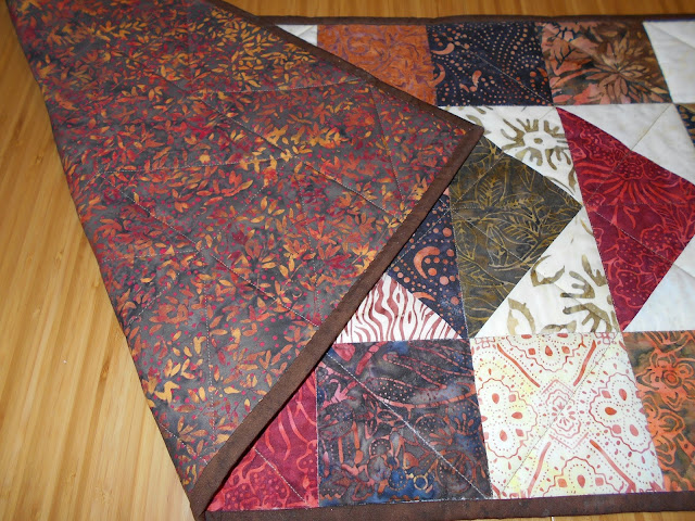
I decided to use the backing fabric for the binding. I thought it would look good.
Backing with matching binding
I'm not thrilled with the way the binding turned out on the front. I didn't realize it would come out looking like the stripes on a barber pole once it had been trimmed and folded into a narrow strip. It does look nice on the back, though.

I tried something new (for me) with the binding. Instead of machine-sewing it onto the front, folding it over, and then hand-sewing it down on the back, I wanted to spare myself the tedious hand-sewing. I machine-stitched the binding onto the back of the project, folded it over, and then machine-stitched it down on the front, very close to the folded edge. That was SO MUCH easier.

I wasn't sure how it was going to look on the back. I don't think it looks that bad. In some places you can't even see the top-stitching. In other places you can see it, but it's on the back, so I can live with it.  
You can see the top-stitching a little bit

If I had matched the thread color better, this might have been less noticeable. As it happened, I just decided to use a color I had on hand. It was close, but somewhat darker than the fabric.
 
Lessons learned:

1. Measure twice, cut once.
2. Relax.
3. Give yourself a realistic but not too distant deadline.
4. A solid color might be best for your binding. Test a print by folding it into a narrow strip.
5. Don't be lazy when it comes to thread color.

Wednesday, July 15, 2015

Simply Elegant Table Runner

Simply Elegant Table Runner. That's the name on the pattern. I actually don't think it's an accurate description of this project. It IS simple, and it IS a table runner, but it doesn't strike me as elegant. I might have called it No-Nonsense Table Runner or Stripped Down Table Runner or maybe Hopscotch Table Runner.

I am using a kit from Timeless Treasures (Tonga Treats line). It came with the fabric and the pattern. The color run I am using (see photo below) is called "Pashmina." 

Pashmina paint
I definitely would not have named this color run Pashmina. "Pashmina" is a "fine quality material made from goat's wool." And - I'll bet you didn't know this - Benjamin Moore has a paint color called Pashmina. I would have called the batik color run Bali Garden or something along those lines.


I started it earlier this year, and then it got put aside while I traveled a bit. Last week I made a commitment to finish it before August 13. 

Yesterday I made the quilt "sandwich" using spray baste and Insul-Bright batting. This is an insulated batting that is perfect for table runners. 

Uh oh! Something went wrong and I didn't have a long enough piece of Insul-Bright. I decided to overlap two pieces and sew them together with a zig-zag stitch. This worked out well, and I don't think it will affect the appearance.
Today I started doing the actual quilting. This is the hardest part for me. 

I am doing free-motion quilting. I am hoping that with practice I will get to the point where I can maintain even stitch length and smooth lines. I'm not there yet. I do hope that Malcolm Gladwell's 10,000-Hour Rule doesn't apply to free-motion quilting. I don't know if I would have the perseverance for that.

It is quite a bit easier with my new sewing machine because it has a speed control, but I'm still trying to figure out the optimal speed. I had it set too slow, and my stitches were all over the place. I set it a little faster and that seemed to help.

Today I did half of the quilting and then realized that my left wrist was almost broken and my left arm was falling off. Did somebody say Advil? I guess I was too tense. I will have to wait a couple of days before I can continue.

Wednesday, June 17, 2015

Herald Square - June 2015 BOM

This block is called Herald Square. I like the way the points came out. I think my new sewing machine makes it easier to sew more accurate seams and that makes it easier to turn out good points.
MORE pink
I don't like the colors so much. Too much pink/red, not enough blue and yellow. But that's what they gave me. I also don't like that dark green. It's not a nice color and it doesn't contrast enough with the print. True, I substituted prints, but I don't think it would contrast enough with the black background of the original print. I like a lot of contrast.


Now we are halfway through the year.  The first three blocks have a 9-patch center, which unifies the look of the project,  and they all have a bit of yellow and blue, which makes it pop. I like these three pieces together.


The next three months don't even look like they came from the same quilt as the first three. They are REALLY pink. They have lost that 9-patch center, though they do still have a single small square in the center. I think they are less attractive patterns.


I'm not sure how it's going to look in the finished quilt top. I may have to fiddle around with the layout to make sure the blue and yellow pieces don't end up in one corner and all the pinks in the opposite corner.


Tuesday, May 26, 2015

Migrating Geese Table Runner

I made a table runner using a Timeless Treasures Tonga Treats kit that I bought for practically nothing on sale from Craftsy. I love batiks! This color run is called Spice. The pattern for the table runner was included in the package.
Here is the backing. The backing, binding, and batting were not included in the kit.
I used Insul-Bright for the batting. It is an insulated backing designed for projects like this. Theoretically you could put a hot dish on it and your table would be okay. I'm not going to do any experiments to see if that is true. It's nice to know that I have a little extra protection, though. Insul-Bright is washable, too. What a great idea.
I sewed the binding down by hand. That wasn't too bad for this size project. I don't know if I would want to do it for a bed-size quilt. However, I do prefer the way it looks
I stitched in the ditch around the squares and then I stitched diagonally across the squares in an alternating chevron pattern. The squares that consist of two different prints do not have stitching along the seam where the two prints join - i.e., all of the squares have only one diagonal quilting line.

Although the overall project is somewhat busy, I don't like the two fabrics with such light prints that they appear to be practically solid cream. One has very light dots. The other is, I think, called Java Blender. I wish I had tried to substitute. If I were doing it again, I would substitute with a low-contrast print in a light rust and/or light brown.

What did I learn from this project?

1. Small projects are really easy.
2.  Geometrical quilting lines are really easy.
3. You don't have to use what's in the kit.
4. It IS possible to completely finish a quilting project!

Wednesday, May 13, 2015

Tea in the Garden - May 2015 BOM

What an ugly block. That dark green just doesn't work. The tone is off.
Do I detect even MORE pink?
And I really don't like the pattern. No I don't. It's very blocky. And it looks like an Iron Cross.

It doesn't suggest to me either tea or a garden.

Wednesday, April 15, 2015

Winged Monkey - April 2015 BOM


Oy! That's a lot of pink. There is practically no contrast in the corners. And the wavy lines go in all different directions. :(

At least the points turned out nicely.