Showing posts with label contrast. Show all posts

Wednesday, January 15, 2020

Play by Play

Part 3

Part 3 of the Frolic! quilt calls for half-square triangles with a neutral fabric for one half and either dark blue or light blue for the other half. I used Bonnie Hunter's Essential Triangle Tool to cut the pieces from short (for greater variety) fabric strips. There are other methods for cutting half-square triangles, but I really like this method because it seems to minimize waste. It's also fast, because you can cut both halves of the square at the same time.
Some of my half-square triangles

Part 4

In Part 4 I finally got to use some of my aqua fabric. I found a really fun print that I am going to use as an aqua. I almost could have used it as a neutral. It has accents of raspberry, dark blue, and sage green (coming up eventually), and the pictures are soooo charming. (OK, so I realize they won't be that charming after I cut the fabric into a lot of little triangles, but I will know what was there.)

Part 4 was very complicated. I had to make a number of sets of blue and aqua. Each set has 4 half-square triangles, which I had to cut out and sew, and 4 blue quarter square triangles plus 4 aqua quarter square triangles, which I did not have to sew (yet). Each set can (and, for a scrappy look, should) be different, but the blue and aqua fabrics within a set have to be the same for all the pieces in the set.

I can't show you a picture of a complete set because I used certain elements of each set in a later part. Here are some of my completed HSTs. Each one is from a different set.
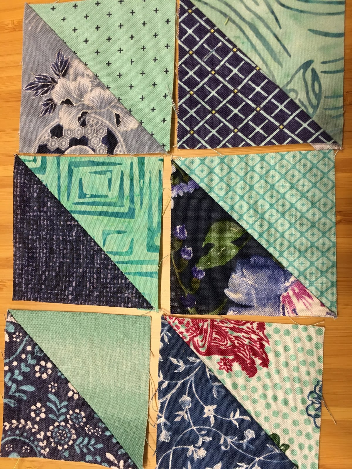

There is a way to cut out both the HSTs and QSTs from a single strip (if you are careful!) using the Essential Triangle Tool. I had to make some adjustments, but I was able to do it.
The Essential Triangle Tool

One aspect that was especially tricky was getting sufficient contrast between the aqua and the light blue. I like contrast a lot, and I wanted to have as much contrast as possible, so I tried to avoid certain combinations of aqua and light blue. I am probably going to end up with about 70 to 75% of my sets being made with dark blue, but I think I will like that. Here is a pairing that I made where I didn't love the contrast.

Here is a trick for studying contrast. Change your photo to black and white and see what the contrast looks like.


It's actually not as bad as I thought. 

But look at the contrast between aqua and dark blue. It is much stronger for the five dark blue HSTs than for the light blue one in the upper left corner.


I am going to trust Bonnie Hunter and keep some light blue in the quilt. What do you think?

Wednesday, January 9, 2019

A Revealing Feeling - Good Fortune, Parts 7 and 8


Bonnie Hunter revealed the full design of the Good Fortune Quilt this week after surprising us with Clue 7 a few days earlier. It's stunning. It's wonderful. I feel so fortunate to be a part of this quilt-along.

But, I now have a lot of work to do. I have to finish Clues 1-7. Then I can start on the two blocks and four borders described in The Reveal. Bonnie's finished quilt looks amazing. I am really motivated to press ahead and finish mine, but it will have to wait until I get back from my next trip.

I did a tiny fraction of Clue 7. This involved making lots of double pieces by sewing two pieces from Clue 2 together. In addition, we have to make a small number of quad pieces made with pieces from Clue 2. Here are some of the quad pieces:
Clue 7 also called for making some quad pieces with pieces from Clue 1.

Clue 7 went a little faster because there was no cutting involved, but I did make another trip to a fabric store this week, and that took up some time.

Now, before I go on, I want to talk about a New Thing. During this quilt I started listening to podcasts. That's a New Thing for me. I'm really enjoying it. My daughter recommended Serial, so I started with that. Then I added Lexicon Valley, because I love words and linguistics. Then I found a few more interesting ones. Then I got the idea that there might be podcasts about quilting, and I found several! These are some that looked interesting:
  •  Quilting . . . . for the rest of us
  •  Sit & Sew Radio
  •  The Off-Kilter Quilt
  •  Just Wanna Quilt
These quilting podcasts are not professionally produced (I assume) but they are something fun to listen to while I am quilting. Do you have any favorite podcasts?

OK, back to the Good Fortune Quilt. I didn't have a lot of time to work on it this week. I couldn't do much without finishing some of the previous clues, so the first thing I did was to finish Clue 1 completely. Then I decided to make one sample each of the two blocks shown in the Reveal. 
 
Here they are:
The Spinning Star Block


The String Chain Block


These blocks alternate in the finished quilt in a checkerboard pattern and the result is wonderful. I like the Spinning Star Block a lot. I'm not so sure about the String Chain Block. I don't think the red and orange work well together. There is not enough contrast for me. However, I think (hope) that when it is all put together and viewed from a few feet away it will look fine.

Please take a look at Bonnie's Link-Up page and check out some of the finished blocks (and even finished quilt-tops!!) that other people have done. It is so much fun to look at them.

Lessons Learned:
  • If you can't sew with friends, sew with podcasts.
  • Procrastination has its rewards. I only had to make 192 pieces for Clue 1, not the 240 originally specified.
  • Doing sample blocks to start is probably a good idea. The blocks are supposed to be the same size. It turns out my String Chain Block is almost 1/4" larger than the Spinning Star, which is the correct size. I need to think about this before I do any more work with the String Chain Blocks or the components thereof.
  • There is treasure at the end of the rainbow! Just be patient and follow it.
 

Tuesday, January 10, 2017

"Business" Card Holders

First, let's be clear about one thing: I don't have business cards; I have retirement cards.

I am soon going to a mini-reunion with some dear friends from school many moons ago. I decided to make a gift for each of my friends. This time the gift will be "business" card holders.

I used some fabric from a Kaffe Fassett collection. I just love his bright, cheerful designs. I found the directions here: Directions for Business Card Holder

The directions were good, but I still had to work at it to get it to come out well. I had to make several trips to various stores to find the right kind of hairbands, the fusible fleece, and the buttons.

I made a lot of mistakes on my prototype. It probably took around five hours what with all the ripping out of stitches. It took me a lot of time to figure out what combinations of fabric to use for each holder, what color thread, what color buttons, etc.

I wanted to use my machine's monogramming stitch (I have a Janome Memory Craft 6500). This added a level of complexity.  After some trial and error I figured out using a tear-away stabilizer would help.

I had to make sure the monogramming would contrast sufficiently with the fabric. I'm not sure I always succeeded with that.

I also had to measure carefully to figure out where to place the monogramming. I first used a scrap of a quilt sandwich to practice the monogramming. Surprisingly, the dimensions of the monogrammed lines were different on the quilt sandwich than on the unquilted card pocket pieces. More ripping out.
Eventually I got them centered, but half of them are probably not fully centered.

I really liked the fusible fleece. It is really more like a batting than a fleece. It fuses very easily and smoothly. I wonder if I could use it on a larger quilt project?

I had a few sewing machine disasters along the way. Something happened with my bobbin case and it got chewed up a little, but I got it working again. Also, at one point a pin fell into the feed dogs and while I was trying to fish it out it went all the way in. Apparently no harm, no foul.

Once I got to the point where the pieces were assembled and turned inside out, I had a lot of trouble with the top-stitching. Then I remembered my trusty old walking foot. It worked like a dream.

When I finally produced a decent result I decided to take an assembly-line approach for the rest. This project had so many changes of thread and feet and stitches, and stitch lengths that it really did save a lot of time to do it in this fashion.

I am pretty happy with the end result:


Phew! The card fits!

They are all different!

Lessons Learned:

Multiply the time estimated for the project by at least three.
Add three extra trips to the store.
Make a practice piece before you waste materials.
Use a light fabric where you plan to monogram.
Remember the walking foot!


Friday, July 31, 2015

Dogwood Crossing - July 2015 BOM

The "kit" for this month's block contains the usual pieces of fabric and instructions.


Page 1
Page 2
Finally, we are back to some yellow and a lighter green.
The cutting this month was tricky. It was not a simple case of following the template. Some of the pieces called for two template cuts and one of the pieces had you using only a portion of the template.  Maybe that's why I couldn't get the pieces to line up properly.
Not a happy camper about this

If you look very closely at the photo above you will see that the cream colored background is not solid. It is a watercolor print with yellow accents, but the color gradations are so subtle that it's very hard to see. Why bother?

 I was able to force all of the other seams to line up, and by ripping out and resewing some of the seams, I was able to get the points to come out nicely.

Again, the problem with the directional print appears. I have learned from this.  :(

Lesson learned:

Lay it out before sewing. If I had done so, I would have then done a better job matching the green triangles to the green rhombuses, especially at the North and East positions on the ends of the green cross. This is not a place where you want contrast.
 

Wednesday, April 15, 2015

Winged Monkey - April 2015 BOM


Oy! That's a lot of pink. There is practically no contrast in the corners. And the wavy lines go in all different directions. :(

At least the points turned out nicely.

Wednesday, March 18, 2015

Coat of Arms - March 2015 BOM


I love the contrast on this block, but I am not thrilled with the way the print triangles look. Maybe I should have cut some extras so I could get four that are going in the same direction.

Lessons learned:
1. Be careful about choosing a directional print.
2. As long as you have enough fabric, there's no rule against cutting extra pieces. 
 
For this year's project we are using Template Set L, The 12" Seven-Patch Block Set.

Why is it called Seven-Patch? Seven-Patch quilt blocks are assembled with a grid of seven squares across and seven squares down. Seven-Patch quilt block grids are not usually subdivided to create additional units. A thank-you to Janet Wickell and About.com for this explanation. I couldn't see the seven squares before it was pointed out to me.

There is a lot more information inside this pamphlet, along with ideas for making 7-patch blocks.

Pieces 68, 69 and 71 have sandpaper grippers. Piece 70 has silicone.
I added little grippers to the backs of the templates. I found that they slide around too much without them. I tried silicone grippers and sandpaper grippers. I didn't like the silicone ones. They elevated the template too much, and sometimes the rotary cutter would actually angle in under the template a little bit and I wouldn't get an accurate cut. The sandpaper works very well.

Wednesday, February 11, 2015

Magnolia Court - February 2015 BOM

I like this square. However, I am disappointed with the lack of contrast between the green squares of watercolor fabric and the green grassy print. My fault for substituting the green print. I was going for color coordination and I lost sight of the importance of contrast.

Changing the subject, here are the color runs that were offered this year:
2015 Color Runs
 From left to right:
  • Halloween
  • Flannel
  • Alaskana (?)
  • Batik
  • Romantic 
These are the descriptions provided by the quilt shop. Usually they offer four color runs. This year is the first time I have seen them offer flannel.

Lesson learned:
If you are going to substitute a fabric, make sure you pay attention to the contrast with EVERY other fabric.

Wednesday, October 15, 2014

Kodiak Star - October 2014 BOM

I made a lot of substitutions this month. I am writing this several months later and can't remember what I was thinking. I assume I didn't like the fabrics in the BOM package. 

As it turns out, I don't like the lack of contrast between the inner star and the inner purple diamond. It is one thing to lay out pieces after they are cut and shuffle them around. It is another thing to be able to visualize the piece before you have cut anything.It is also important to think about how a fabric which seems to be black may give you large light-colored areas when it has been cut.

The July 2015 post shows what the typical instructions for a block look like. They are black and white, and the different fabrics are shown by using different designs, which may not be anything like what you are working with. I think you could get some idea of the finished piece by holding adjacent fabrics next to each other and trying really hard to visualize the finished piece. I was more focused on how the totality of fabrics in the block worked together.

Alternatively, I think if you followed Marti Michell's suggested fabrics consistently you would get a very nice result. That is difficult to do in this BOM program when fabrics are switched out all the time. One month a certain fabric is B, the next month it is D and a new fabric is used as B.

Lessons learned:

Stick with the tones/patterns suggested in the instructions or used in your model (if you are like me).

OR

Spend a lot of time thinking about, visualizing, and holding fabrics next to each other before cutting (if you like to be creative and don't like to follow directions).

Friday, August 15, 2014

Crazy Anna - August 2014 BOM


Different block, same story. Too many fabrics, not enough contrast. I do like the way the black star design stands out.