Part 3 of the Frolic! quilt calls for half-square triangles with a neutral fabric for one half and either dark blue or light blue for the other half. I used Bonnie Hunter's Essential Triangle Tool to cut the pieces from short (for greater variety) fabric strips. There are other methods for cutting half-square triangles, but I really like this method because it seems to minimize waste. It's also fast, because you can cut both halves of the square at the same time.
 |
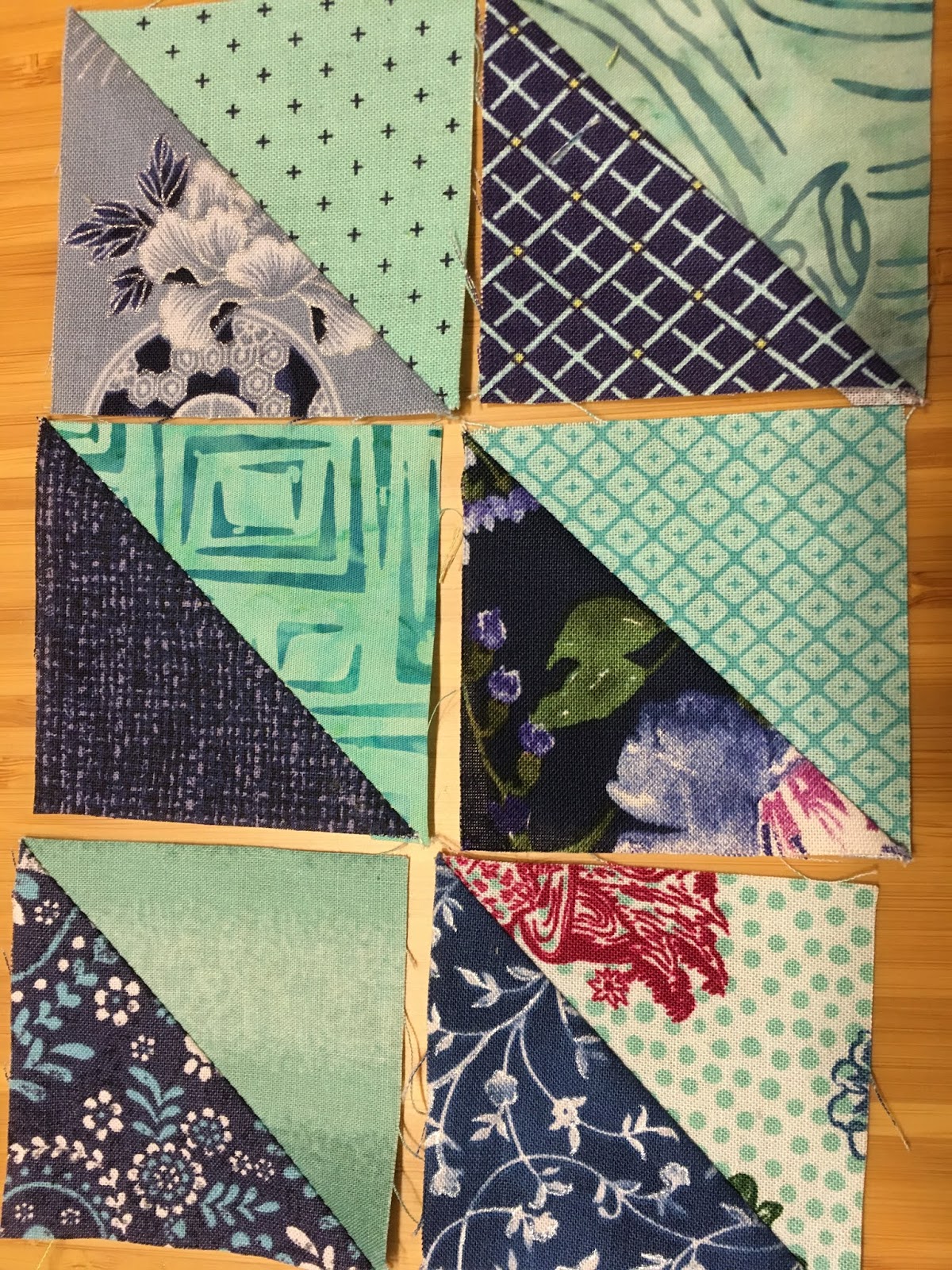
| Some of my half-square triangles |
Part 4
In Part 4 I finally got to use some of my aqua fabric. I found a really fun print that I am going to use as an aqua. I almost could have used it as a neutral. It has accents of raspberry, dark blue, and sage green (coming up eventually), and the pictures are soooo charming. (OK, so I realize they won't be that charming after I cut the fabric into a lot of little triangles, but I will know what was there.)

Part 4 was very complicated. I had to make a number of sets of blue and aqua. Each set has 4 half-square triangles, which I had to cut out and sew, and 4 blue quarter square triangles plus 4 aqua quarter square triangles, which I did not have to sew (yet). Each set can (and, for a scrappy look, should) be different, but the blue and aqua fabrics within a set have to be the same for all the pieces in the set.
I can't show you a picture of a complete set because I used certain elements of each set in a later part. Here are some of my completed HSTs. Each one is from a different set.
There is a way to cut out both the HSTs and QSTs from a single strip (if you are careful!) using the Essential Triangle Tool. I had to make some adjustments, but I was able to do it.
 |
| The Essential Triangle Tool |
One aspect that was especially tricky was getting sufficient contrast between the aqua and the light blue. I like contrast a lot, and I wanted to have as much contrast as possible, so I tried to avoid certain combinations of aqua and light blue. I am probably going to end up with about 70 to 75% of my sets being made with dark blue, but I think I will like that. Here is a pairing that I made where I didn't love the contrast.

Here is a trick for studying contrast. Change your photo to black and white and see what the contrast looks like.

It's actually not as bad as I thought.
But look at the contrast between aqua and dark blue. It is much stronger for the five dark blue HSTs than for the light blue one in the upper left corner.


No comments:
Post a Comment