Showing posts with label BOM. Show all posts

Monday, December 14, 2015

Allietare!

I am not going to start any new projects until I finish some of my unfinished ones.
 
Well, I was surfing the "quilternet" and I found a project that really intrigued me. I was NOT looking for a new project. It is a mystery quilt-along by Bonnie Hunter called Allietare! Here is a link to it: Allietare Intro

Allietare is Italian for "to gladden, delight, or cheer up. "

I just couldn't stop thinking about this quilt-along and it made me feel glad and cheerful.

I like the idea of a mystery.

I like the idea of working with a color palette that I don't usually use.

I like the idea of using paint chips to shop for fabric.

I like being able to use fabric that I picked out. I like the opportunity to experiment with many different prints.

I like the idea of having something to do when my BOM program ends next week. (I have decided not to continue with the BOM program in 2016.

I like the clear and detailed instructions.

I like the idea of being able to see what others are doing with the same pattern.

I love the idea of taking inspiration from your travels - in this case, Tuscany. (I had recently started to think about this after seeing Nancy's work with hand-dyed yarn inspired by her travels: Fireweed Dye Works).

I love the idea of working on a project that I am very excited about.

You guessed it. I have started Allietare!
  
I didn't find this project until it had been up and running for a week and a half. I hesitated to start for fear of not being able to catch up. But then I read Bonnie Hunter's encouragement to do as much as you can every week and then shift to the new clue even if you haven't finished the old one. That took a lot of (self-imposed)pressure off me. 

The instructions are for a quilt 82" x 96". That's more than I want to commit to, so I am going to make half as many pieces to end up with a half-size quilt. For now I am just going to make half of the half - until I get caught up.
My first step was to go to the hardware store and get the paint chips suggested by Bonnie Hunter. It was fun. I love paint chips. The colors are amazing, and I love the names of the colors. 

The next step was getting some fabric. Some people have a big stash and they can just pull fabric from their stash and start sewing. I have practically no stash, so I get to go to the fabric store. I just happened to have some good coupons for Jo-Ann, so that seemed like a good place to start. 

Here is what I got: 
Some reds and golds
Some blacks, and ONE gray, which will be the constant fabric
(The gray got a little washed out in the camera flash)
Several neutrals
This is going to be so much fun. I am delighted!

Saturday, December 12, 2015

Palace Garden - November 2015 BOM

I'm almost done with this year's BOMs!

The block for November went relatively quickly. It is called Palace Garden. It does have the look of an aerial view of the type of formal garden one might see at a palace in Europe. 


What makes this month's block different is that it has a curved seam based on the curve used in the traditional Drunkard's Path pattern. This was my first time cutting and sewing such a seam. I had to make two templates and they weren't easy to use. It was very difficult to cut the curves with a rotary cutter, so I ended up cutting by hand with scissors. (It is interesting that you need two templates for the single curve. With your seam allowances, the two curves need to be different sizes.)

It was difficult and I don't like the result. I think you could do some nice designs with Drunkard's Path, but I don't like this one. This is a seven-patch block, so the quarter circles are intersected by a center cross. This flattens out the circle into more of a square with rounded corners, and I don't particularly like the the way that looks.

Here is a sample of a traditional Drunkard's Path, made by Tim Latimer and posted on his blog, Tim Latimer - Quilts etc 


Lessons learned:
  • Avoid curves.
  • If you think you have made a cutting mistake and run out of fabric, don't freak out. Don't run out to the store. Calm down and breathe. Maybe even wait overnight. When you come back to it, you may find that you did not make a mistake after all.

Sunday, November 1, 2015

Circle of Friends - October 2015 BOM

Circle of Friends is a great name for a quilt block. I like this block a lot. I like the colors (but I was a little surprised to see a NEW color, magenta, in month 10). I love the bright star in the center. I love the way the outer stars interlock, like a circle of friends holding hands.

This BOM was a little bit harder than some. I had trouble with the outer strips. When you cut the rhombus, you start out with a rectangle, and then you cut the corner off. It's hard to get it just right when you cut and when you sew the triangles onto the missing corners. The result is a new rectangle, but when you sew the rectangles together, they don't always align well. I re-did some of these pieces 3 times. Rip, rip, rip.

The second problem I had was with the directional print. I thought I had addressed making sure the print squares were all facing the same direction before I sewed the pieces together. It turns out that there are two ways to make the four-patch, and the direction of the print matters. Because the block instructions are planned so that seams alternate nicely, I didn't want to mess with things, so . . . rip, rip, rip.

The third problem was a tension problem. I had been using the machine to repair some t-shirts, and somehow the tension was a little different when I went back to quilting. I didn't figure this out right away. When I noticed the white stitches peeking through, I was not in the proper frame of mind to undo and redo a lot of work.


I am, however, very pleased with how the corners and points turned out.

Lessons learned:
  • Don't just think about the layout. Do an actual layout beforehand, following the instructions.
  • When you cut off a corner to make a rhombus, try stacking.
  • If you use the machine for something else, test the tension before resuming quilting.

Friday, October 16, 2015

Mother's Favorite - September 2015 BOM

Here we go with the September block.

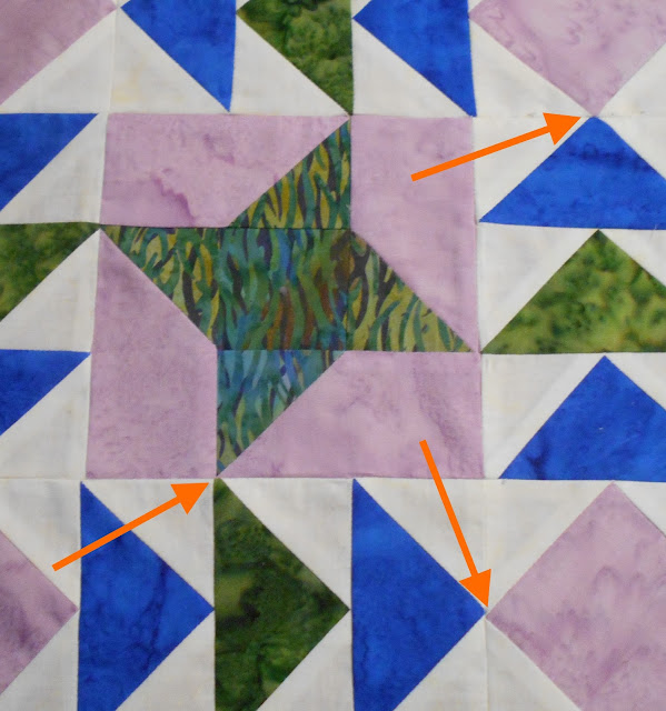
I like the nesting triangles. What I don't like is the background fabric. It is off-white, but it has a very faint watercolor pattern to it. The contrast color is a light orangey-brown. It's hard to see in the photo above, but it shows up more clearly on the fabric. On some of the pieces it is much more noticeable than on others.
To me, it looks like the fabric was scorched during ironing. The scale of the print is such that you can't see the contrast color on every piece. I also think that the scale is larger than the scale of the blue and pink fabrics. It is obvious that the blue and pink fabrics are watercolor batiks. It is not obvious with the background fabric.

I suspect it might look too busy if you used a "more obvious" watercolor print for your background. Maybe the answer is to use a solid, which is what it looks like anyway.

Lessons learned:


  • Before photographing a block, remove stray threads. Otherwise you will have to choose between 1) repeating the process: taking the card out of the camera, putting it into the computer, importing the new photo, editing the photo, struggling with the photo app (the biggie), uploading it to the blog app, etc., or 2) letting people think you are lazy.
  • When selecting fabric, ask yourself what it will look like when it has been cut into small pieces. Is the scale wrong? Will there be pieces without any pattern on them? Will it look stained, or appear to have been scorched?

Thursday, August 27, 2015

Knight and Day - August 2015 BOM

After taking Rayna's class on making art quilts without measuring or using rulers, it's interesting to get back to this type of project, which calls for a lot of precision and goes very slowly.
Speaking of precision, I found this one rather difficult because there are some spots where there are so many layers of fabric that it's hard to get a nice crisp point. I actually like the appearance of the block, but it's not an easy block to do, and maybe it shouldn't be done at all. There are so many other possible blocks that won't present this type of challenge.

Despite my best efforts, and my seam ripper's best efforts, there was a palpable lump wherever two points came together. In some cases the lump itself made it hard to match up the points because the fabric wouldn't lie flat at the site of the lump.
Examples of problem areas
Maybe it would be better to avoid patterns with a design that has too many layers of fabric in one spot. Or maybe I need to pin and sew more carefully?

I did get to try out a partial seam technique on the center star of this block. It really wasn't that hard.

My final comment has to do with the colors. I would have tried to put some of that beautiful yellow fabric into this block. I'll have to wait and see what it looks like when all 12 blocks are done.

Lesson learned: 
Avoid blocks that are technically difficult if little imperfections bother you.

Wednesday, June 17, 2015

Herald Square - June 2015 BOM

This block is called Herald Square. I like the way the points came out. I think my new sewing machine makes it easier to sew more accurate seams and that makes it easier to turn out good points.
MORE pink
I don't like the colors so much. Too much pink/red, not enough blue and yellow. But that's what they gave me. I also don't like that dark green. It's not a nice color and it doesn't contrast enough with the print. True, I substituted prints, but I don't think it would contrast enough with the black background of the original print. I like a lot of contrast.


Now we are halfway through the year.  The first three blocks have a 9-patch center, which unifies the look of the project,  and they all have a bit of yellow and blue, which makes it pop. I like these three pieces together.


The next three months don't even look like they came from the same quilt as the first three. They are REALLY pink. They have lost that 9-patch center, though they do still have a single small square in the center. I think they are less attractive patterns.


I'm not sure how it's going to look in the finished quilt top. I may have to fiddle around with the layout to make sure the blue and yellow pieces don't end up in one corner and all the pinks in the opposite corner.


Wednesday, May 13, 2015

Tea in the Garden - May 2015 BOM

What an ugly block. That dark green just doesn't work. The tone is off.
Do I detect even MORE pink?
And I really don't like the pattern. No I don't. It's very blocky. And it looks like an Iron Cross.

It doesn't suggest to me either tea or a garden.

Wednesday, April 15, 2015

Winged Monkey - April 2015 BOM


Oy! That's a lot of pink. There is practically no contrast in the corners. And the wavy lines go in all different directions. :(

At least the points turned out nicely.

Wednesday, March 18, 2015

Coat of Arms - March 2015 BOM


I love the contrast on this block, but I am not thrilled with the way the print triangles look. Maybe I should have cut some extras so I could get four that are going in the same direction.

Lessons learned:
1. Be careful about choosing a directional print.
2. As long as you have enough fabric, there's no rule against cutting extra pieces. 
 
For this year's project we are using Template Set L, The 12" Seven-Patch Block Set.

Why is it called Seven-Patch? Seven-Patch quilt blocks are assembled with a grid of seven squares across and seven squares down. Seven-Patch quilt block grids are not usually subdivided to create additional units. A thank-you to Janet Wickell and About.com for this explanation. I couldn't see the seven squares before it was pointed out to me.

There is a lot more information inside this pamphlet, along with ideas for making 7-patch blocks.

Pieces 68, 69 and 71 have sandpaper grippers. Piece 70 has silicone.
I added little grippers to the backs of the templates. I found that they slide around too much without them. I tried silicone grippers and sandpaper grippers. I didn't like the silicone ones. They elevated the template too much, and sometimes the rotary cutter would actually angle in under the template a little bit and I wouldn't get an accurate cut. The sandpaper works very well.

Wednesday, February 11, 2015

Magnolia Court - February 2015 BOM

I like this square. However, I am disappointed with the lack of contrast between the green squares of watercolor fabric and the green grassy print. My fault for substituting the green print. I was going for color coordination and I lost sight of the importance of contrast.

Changing the subject, here are the color runs that were offered this year:
2015 Color Runs
 From left to right:
  • Halloween
  • Flannel
  • Alaskana (?)
  • Batik
  • Romantic 
These are the descriptions provided by the quilt shop. Usually they offer four color runs. This year is the first time I have seen them offer flannel.

Lesson learned:
If you are going to substitute a fabric, make sure you pay attention to the contrast with EVERY other fabric.

Thursday, January 15, 2015

Turley's Inn - January 2015 BOM


The January block is called Turley's Inn. I googled it to see if it was a traditional block, but I couldn't find anything. So far I really like the colors.
My Turley's Inn Block


I laid out the pieces very carefully so that the grassy lines all went in the same direction. I wish I had remembered to do this in all of the blocks.

Thursday, January 1, 2015

2015 BOM - Bordered Rows

I began the 2015 Block of the Month program in January at my local quilt shop. The quilt top for 2015 is called Bordered Rows, and it comes from Marti Michell.  If I had known the  pattern in advance, I might not have signed up to participate in the program this year. But the way BOM works is you don't know what you are going to get. All I knew was the blocks would be set on point and what color runs we could choose from. You only get a block pattern once a month and you don't get the finishing instructions until you are about halfway through the year.

This year's design uses special fabric sold by Marti Michell. It has a complicated striped print as part of the finishing. If you don't use a stripe, you are going to have to think very carefully about what to use to have the quilt come out looking nice.

I think the quilt, as made by Marti Michell, is very UGLY - both the fabrics and the pattern.
Marti Michell's Bordered Rows Quilt
I especially don't like the asymmetrical placement of three rows of chevrons at the bottom vs. two rows at the top. The three rows look awful and detract from the blocks themselves.

To be honest, I didn't really like any of the color runs offered by my quilt shop, either. I ended up choosing a run consisting of watercolor batiks in primary colors. 

There was one multi-color print in the color run - a batik with a black background. I decided to substitute a grassy print with a green background because I was tired of black.
The fabric I didn't use

Saturday, November 15, 2014

Autry Square - November 2014 BOM


I do not like this, Wilted-quilt

I do not like this on a train
I do not like this in the rain
I do not like it in the snow
I would not quilt a tic-tac-toe

I will eventually post a photo showing all of the blocks together. It will then become obvious that this square stands out like a sore thumb. Look at the photo of Marti Michell's quilt in 2104 BOM - Secret Garden (January 2014) to get a better idea. Hers is actually not as bad because she has more uniformity of color to tie the blocks together, and the crossbars tie in nicely with the sashing. That will not happen with my quilt top because the sashing is green and dark gray.

Lessons learned:

1) If you don't like a block, why not substitute another block?

2) Over-substitution of fabrics might solve one problem, but can create another problem when the squares don't have enough in common.

Wednesday, October 15, 2014

Kodiak Star - October 2014 BOM

I made a lot of substitutions this month. I am writing this several months later and can't remember what I was thinking. I assume I didn't like the fabrics in the BOM package. 

As it turns out, I don't like the lack of contrast between the inner star and the inner purple diamond. It is one thing to lay out pieces after they are cut and shuffle them around. It is another thing to be able to visualize the piece before you have cut anything.It is also important to think about how a fabric which seems to be black may give you large light-colored areas when it has been cut.

The July 2015 post shows what the typical instructions for a block look like. They are black and white, and the different fabrics are shown by using different designs, which may not be anything like what you are working with. I think you could get some idea of the finished piece by holding adjacent fabrics next to each other and trying really hard to visualize the finished piece. I was more focused on how the totality of fabrics in the block worked together.

Alternatively, I think if you followed Marti Michell's suggested fabrics consistently you would get a very nice result. That is difficult to do in this BOM program when fabrics are switched out all the time. One month a certain fabric is B, the next month it is D and a new fabric is used as B.

Lessons learned:

Stick with the tones/patterns suggested in the instructions or used in your model (if you are like me).

OR

Spend a lot of time thinking about, visualizing, and holding fabrics next to each other before cutting (if you like to be creative and don't like to follow directions).

Monday, September 15, 2014

Shutterbug - September 2014 BOM


Yes, it does remind me of the lens of a camera. I like the motion and the three-dimensionality of this one. I think this is my favorite block in the 2014 BOM series.

Friday, August 15, 2014

Crazy Anna - August 2014 BOM


Different block, same story. Too many fabrics, not enough contrast. I do like the way the black star design stands out.